Summary
This UX case study demonstrates how I joined the UX design team at myworld.com, an e-commerce platform (marketplace) that connects businesses and customers in Europe. I worked on various projects, such as optimizing the checkout process for mobile users by reducing the number of steps and highlighting the important actions, adding new features such as reviews and ratings to increase trust and engagement, and working on special campaigns such as “benefits” to offer additional value to the users. I used an agile and user-centered design process, from research and sketches to high-fidelity prototypes and testing. I collaborated with product owners, developers, and another UX designer to deliver solutions that improved the user experience and met the business goals.
The Background
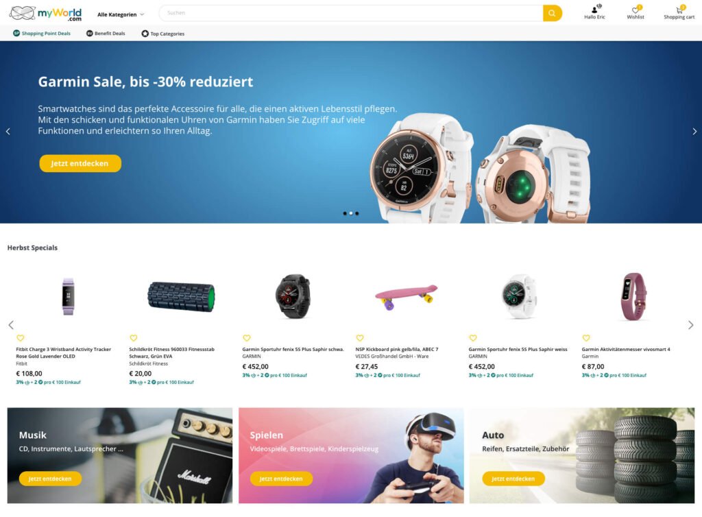
myworld.com was e-commerce website (marketplace) that connected companies and their customers in more than 6 countries and languages across Europe. The company intention was to optimise the current product and extend this reach to additional countries and customers (which was acomplished – during my first year in the company we managed to expand to more than 10 countries).
The company had offices all over Europe, already had Graphic designers and collaborated with a UX designer, but they realised they needed now in house UX designers in order to grow their business. This is when the UX design department was created – in Vienna (me), my coleague from Warsaw and our team lead in Zurich.
My Role
My main tasks were related to analyzing and optimizing the e-commerce website and the user flow but also adding new features and even a mobile app that we were asked to design. In many of my projects I collaborated with the colleague UX designer and I worked closely with with the product owners and with the developers team. We were of course working Agile, in Sprints.
An interesting challenge
When I took over and I started analyzing I realised there was a lot to optimise because everything they have done so far was created in “desktop first” concept. Now we had to rethink and optimise for “mobile first” because a considerable amount of our customers were using mobile. There were issues that were making hard for our users to purchase products – they had to scroll to see important information, some buttons were not visible enough, we had too many steps in the checkout process.
The process
When starting a project I used to begin with a brief establishing clearly our targets and purpose, having documentation and use cases, having a preliminary meeting (sometimes a brainstorm) with the team then I went into research and sketches (Miro or paper) low Fi mocks followed by a short discussion with the team to make sure we are on the right track then I went into High Fidelity mocks and clickable prototype that could be used for testing.
When the concept was final it followed an export into Zeplin and indvidual assets and specs for the developers then a period of close collaboration with them and with the product owner to make sure the project is implemented correctly and off course testing at the end.

In the begining
There was a very small style guide available at myWorld which I have used as base. I had talks with the product owners and developers to understand their expectations and to know the platform better then I analysed in depth the website on production to identify all the elements and bring them together into a comprehensive style guide to be turned into a design system in the next steps.

After defining the base elements (atoms and molecules) components containing them were also defined and I added CSS code to help guide the programmers that i was collaborating with. This was shared with them in Zeplin platform.
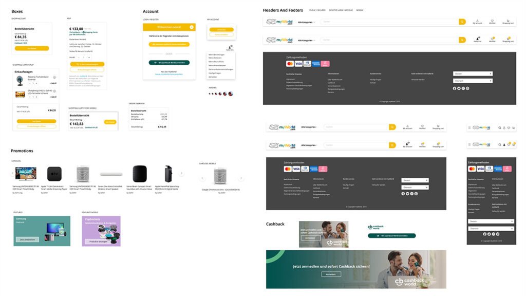
This effort seemed maybe much at the moment but in time it proved it’s effectiveness, specially when creating new features or updating the style of some of our old products, also while doing this UI inventory I already detected together with the team some things that could be improved and we started planning this for future. For example the header navigation trough categories, the footer, the product page and also we detected some accessibility issues.
I was collaborating very often with my colleague UX designer, who was normally working on a different part of the product (the admin interface system and b2b) but I shared my work and research with him to better align the product overall to advise and make some design decisions together.
Then I started looking into the user flows in order to optimize the checkout
I looked for issues that our users encounter when accessing the marketplace with a special focus on the purchasing action. The mobile users had the most issues overall as in the past focus was on desktop so our product was not always very well optimized, and some serious issues came out – for example the cookie notice covering the complete purchase button on small screens. This was solved fast by making the cookie notice transparent and showing what is underneath, but It was clear that on long term we need to redesign the page.
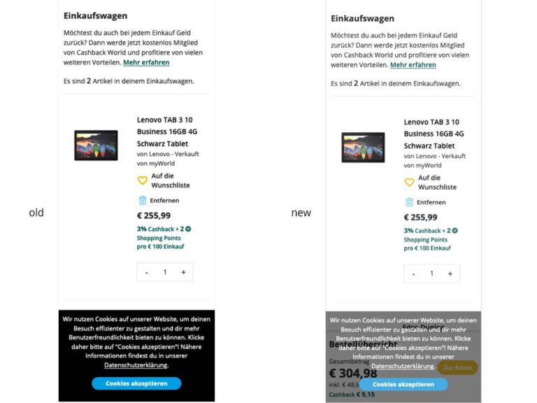
In the next step the shopping cart on mobile was optimized so that we won’t waste precious space and users do not have unnecesary scrolling, in the new view the users could see better the order summary and complete or edit their orders if needed.

But it was not enough so we needed to remake the checkout process
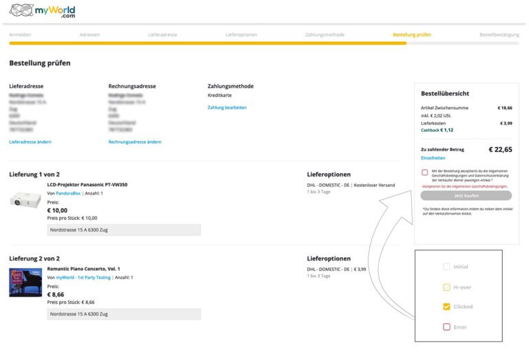
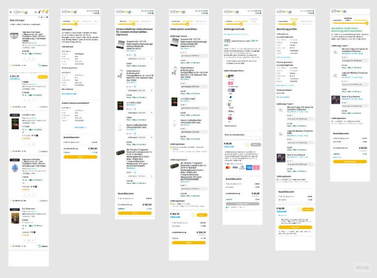
After all this these small tweaks that I did together with the team to improve the checkout we saw some increase in the completion rate and a decrease in the drop rate but they were not enough to improve our customer experience and to make the buying easier for our customers. The reason was that we had a very long checkout – no less than 7 steps the users needed to go trough: shopping cart, address, delivery address, delivery options, payment, confirmation, succes page.
So we took a radical decision, we looked for a way to move them all into one page. The so called “one page checkout”.
Working as a team (with my colleague UX designer, PO’s and CTO) we explored different possibilities and ways to transform the flow, unify and simplify the entire checkout process.
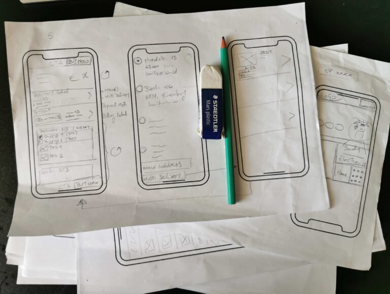
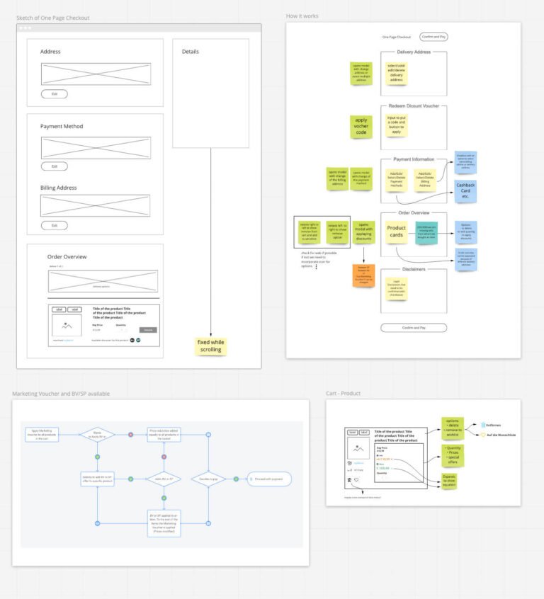
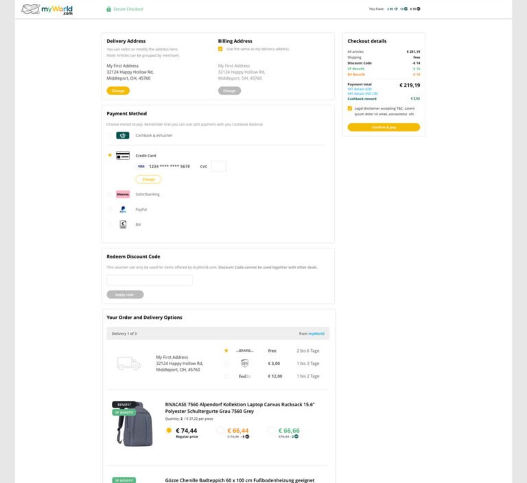
A new user flow was agreed upon and I came up with the concrete solution which contains delivery and billing adress , payment, discounts, delivery options, all on one page instead of seven.
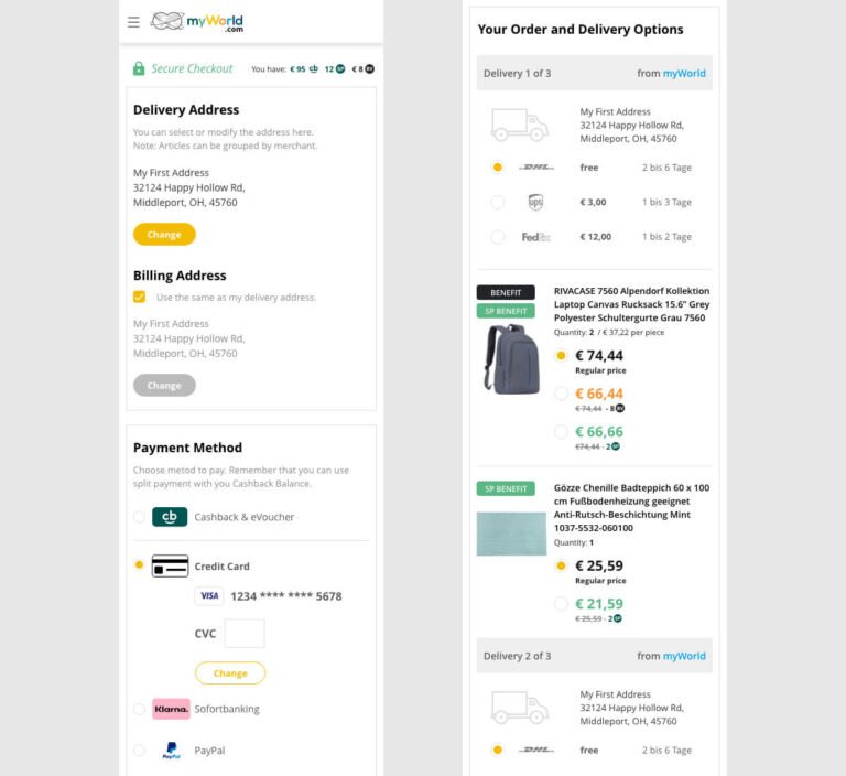
Company focus was mobile first but off course we needed also the desktop version , This is why I created the desktop version which contained one single page with sticky order details.
After improvements, we started adding new features
After myworld.com marketplace was optimized and the product improved in terms of usability, the most interesting part came –I made together with the team a full full analysis of our product and a competitor analysis (Amazon, Universal, MediaMarkt) to see what could be improved. We then realized our users could greatly benefit from reviews and ratings, because it would help them chose between products and merchants and gain trust easier, so we started on this path.
The decision was to approach seller rating first so I worked on a system with percentages and color codes to show the overall rating to our users.
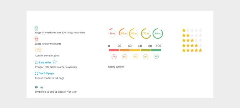
And a way to integrate it within our product page so that it provides basic information on a first view, like the location of the seller (to take benefit from our advantage as local sellers vs our competition and also to benefit from the increased trust as local brands)
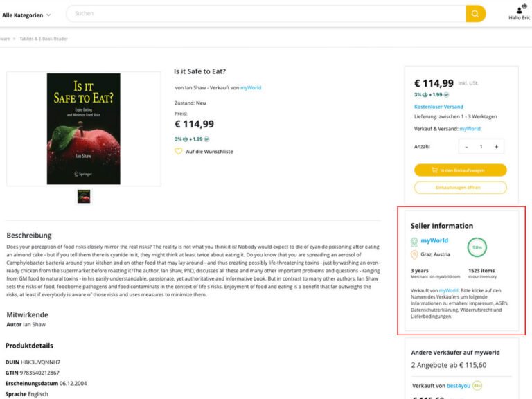
Also included was a detailed view with data about the seller activity and comments from other users, so that the users can take decisions easier.

Product ratings
Then the next step was the product ratings and reviews, giving our users the possibility to see what others are thinking about a specific product and to be able to chose easier based on the rating.
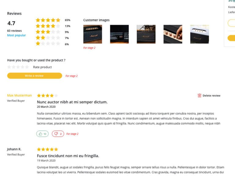
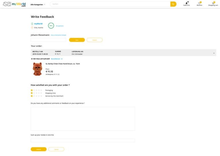
And offcourse we were allowing our users to leave a feedback after they purchased a product.
Going even bigger
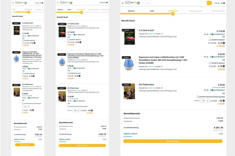
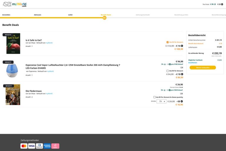
Then there were special campaigns like the “benefits” which had to be developed at a company group level, so it took a lot of communication and synchronization between companies and teams to make them work everywhere. In this case, only a part of our users had access to special benefit currency (earned from another company) which can be used on special benefit deals in our marketplace and in several other places.
A challenge here was to present this special promotion next to the normal prices for our special users and do not show it for the rest and to adapt it for mobile screens too.

But the trickiest part was integrating this promotion in the checkout process and to make everything clear for our users – how they can use it, how much they need to pay.
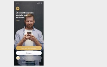
Mobile app and new features
One very extensive project and a real challenge that I had toghether with the team (colleague designer, CTO, several product owners, marketing director) was to design a mobile app for our marketplace platform because we wanted to offer the best mobile experience to our users. New features were supposed to come together with the mobile app.
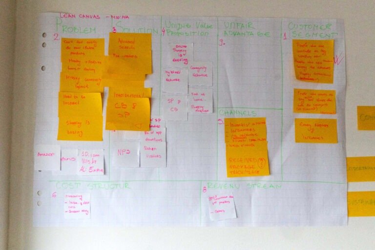
We initially had a brainstorm as a team, combined existing data from our desktop website, competitor analysys and research data regarding our users, an initial list of features and specs was created then I did toghether with my coleague designer sketches and low fidelity prototypes and we met again with the full team in Zurich for a few days workshop where we used a Lean Canvas approach to refine them and to determine which new features could possibly make a difference, like gamification and community.
I then proceed with the higher fidelity mockups and made a plan for usability testing.
Please click here to continue to the mobile app case study.