 mobile app
The Background
One very complex project and a real challenge that I had as a designer and a team (with my colleague designer, CTO, product owners, marketing director) was to design a mobile app for our shopping platform.
We wanted to make shopping more accessible and more entertaining and to create additional benefit for our customers. We have seen through analytics that a significant percentage of our users were using mobile devices so we had to optimize our content for small screens. And we knew that our most demanding challenge is to bring something different from our competitors and a mobile app could bring better features than a website.
My Role
I got involved from the beginning of the project in the research and ideation, defining the concept, mapping the user flows and features, sketching, prototyping to testing, and delivering the MVP and specifications for developers. The project started with a small team (2 designers and a coordinator). As the project grew in complexity and size, the team grew into an eight-person multidisciplinary team.
My designer colleague and I split the work in half to work efficiently, but we also met daily to share our progress and ideas and had regular critique sessions.
First steps – research and define
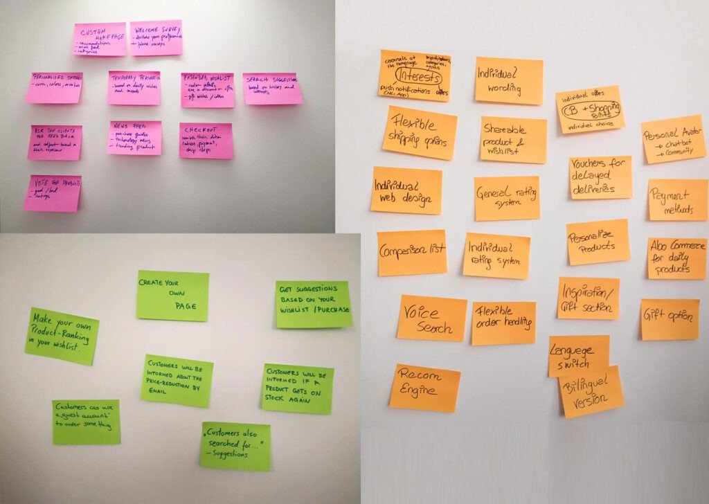
My colleague designer and I sat down with the Product Owner and CTO to determine their needs and ideas about the mobile app. I got access to analytics from the website to assess our existing customer trends. We had interviews, looked at our competitors, and took notes for what was working well and whatnot. Also, I analyzed the website deeply to identify the things we want to change and adapt to in the future by following a mobile-first strategy.
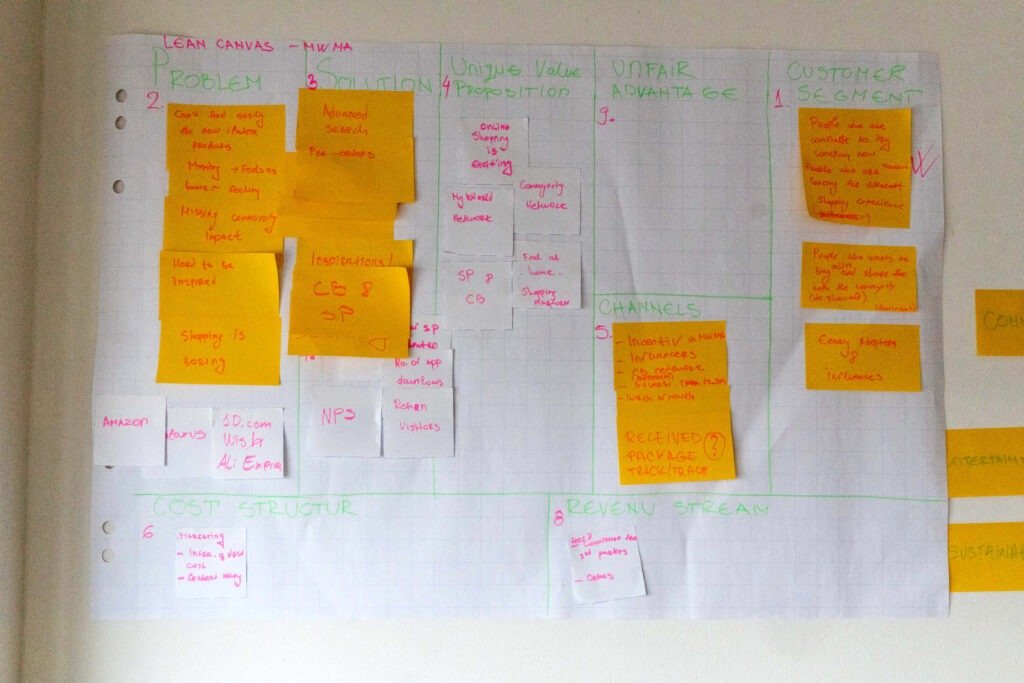
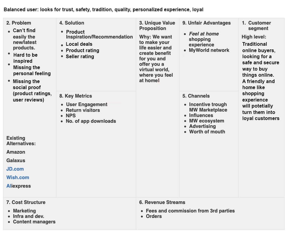
Putting together all this data, I defined (with the team) a new and improved concept for the mobile app, using a lean canvas business model, which we would implement also for the website in the future.
Planning
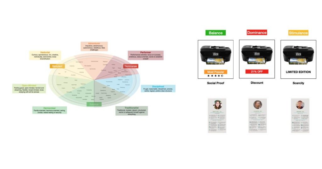
Based on our analysis, we had three primary personas that could fit within the Limbic® types (stimulant, dominance, balance ) – the first two were more open to innovation. At the same time, the last one was more conventional. We made a big project plan containing two significant phases; we focused on bringing the base shopping functionality in the first phase (targeting our balanced customers). In the second phase, we were about to innovate and expand our product with exciting features (targeting our stimulant and dominant personas).
User stories were written together with the PO, and we split the project into small steps (sprints) to follow an agile process; also, a full set of OKR’s was set in place for the entire project as a team and individual. We were using Jira, Confluence, and Betterworks to organize and track our progress.

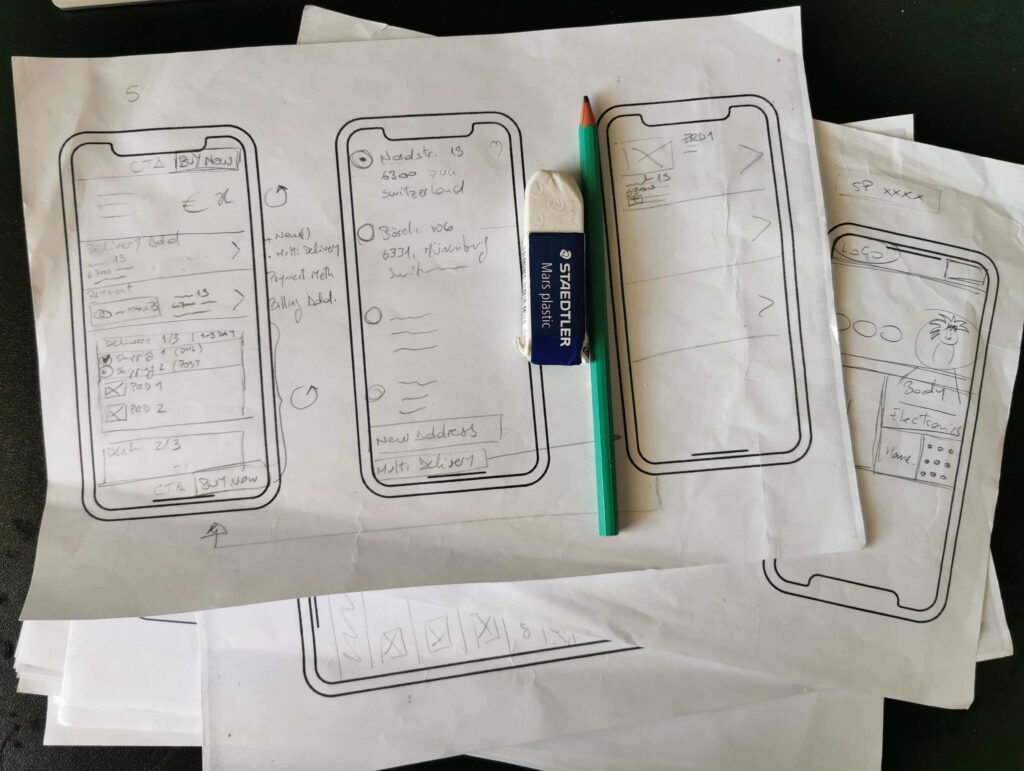
Ideating Solution – design exploration
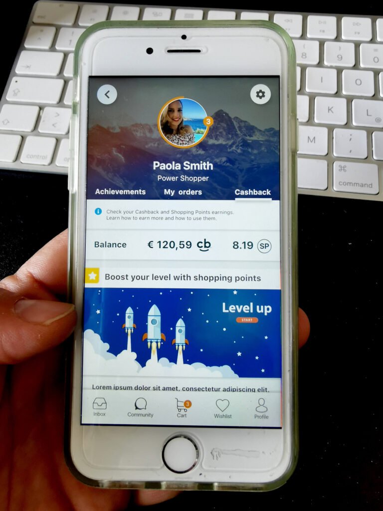
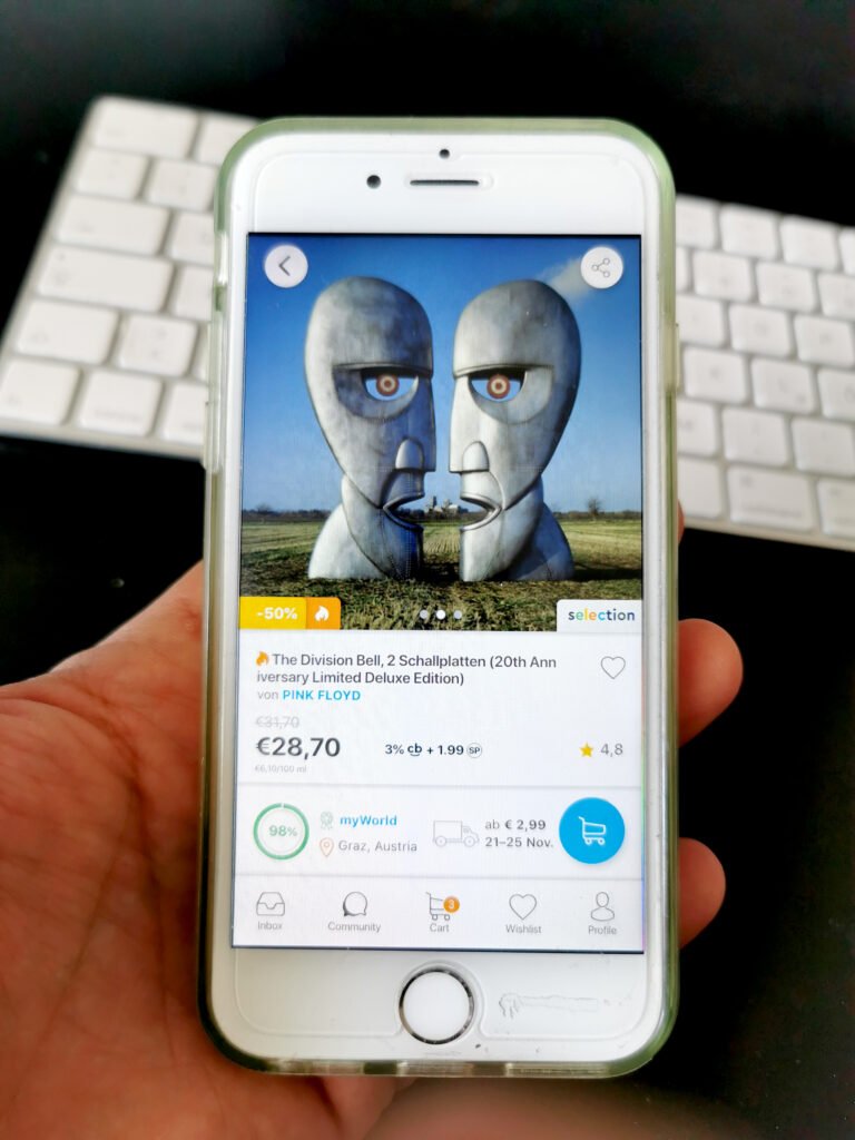
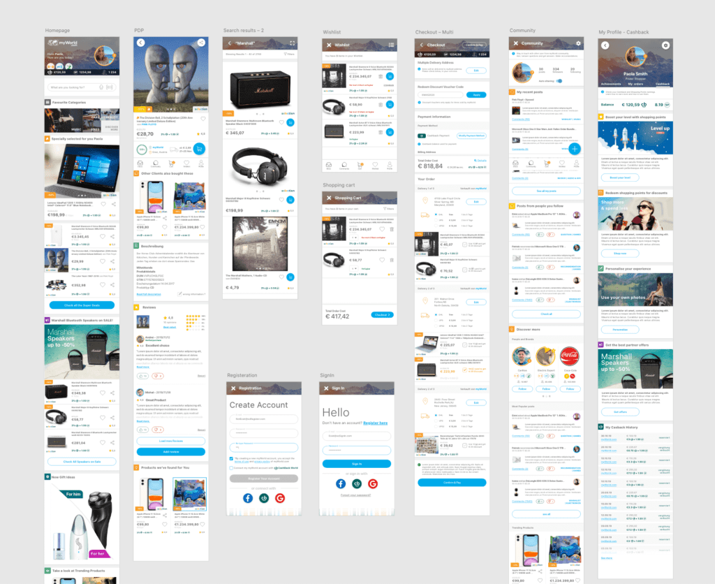
We did sketches and flows for the most challenging sections of our product – the sign-up process and the checkout process. We knew those were problematic on the website because they were too long and too complicated; for example, we also had a Cashback option in the sign-up, and in the checkout, we had no less than seven steps.

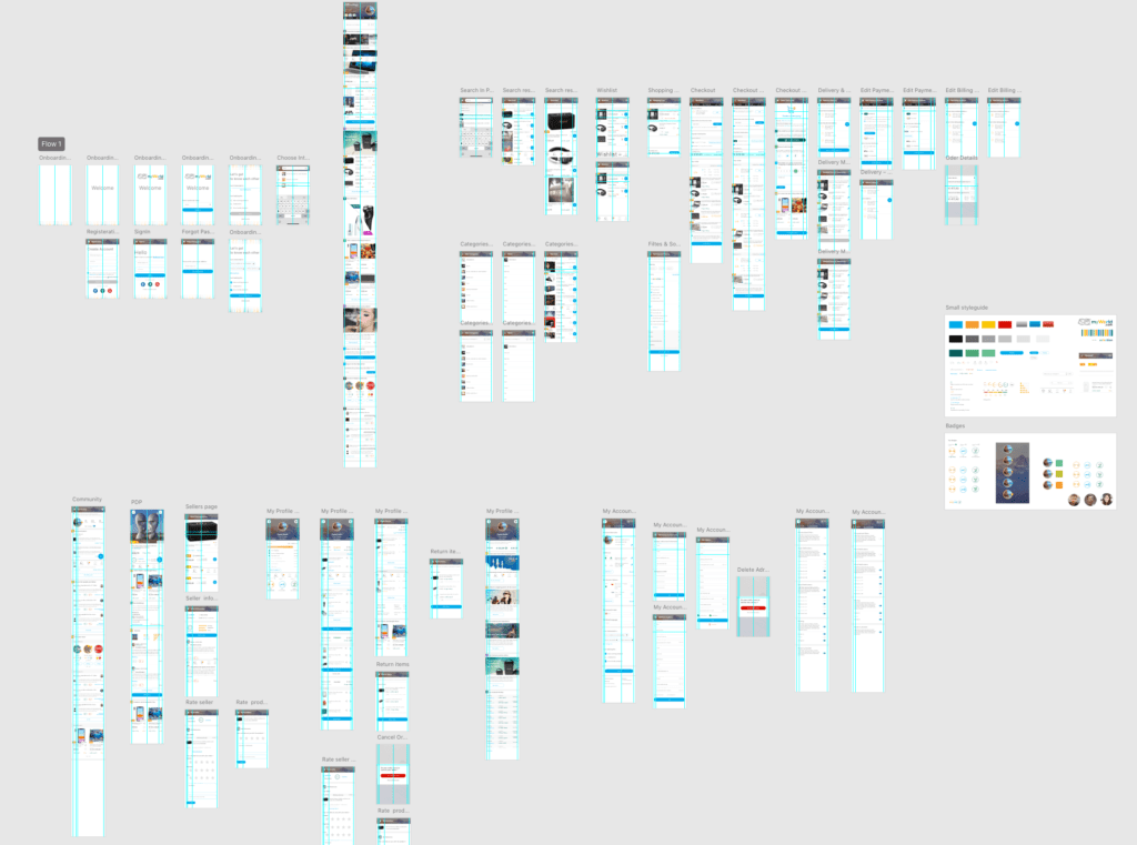
Prototyping
I worked with prototyping software and built the ideas gradually into a more detailed UI that could also be tested by generating a clickable link, even on mobile, using an actual device. We reduced the checkout process from 7 steps into one, so this flow we tested thoroughly. Then I made adjustments based on feedback and observations. We could finally prove that the original color scheme (yellow and white) had severe accessibility issues and needed to be changed, so I explored several different color schemes until I found a proper one.
Phase two – growing
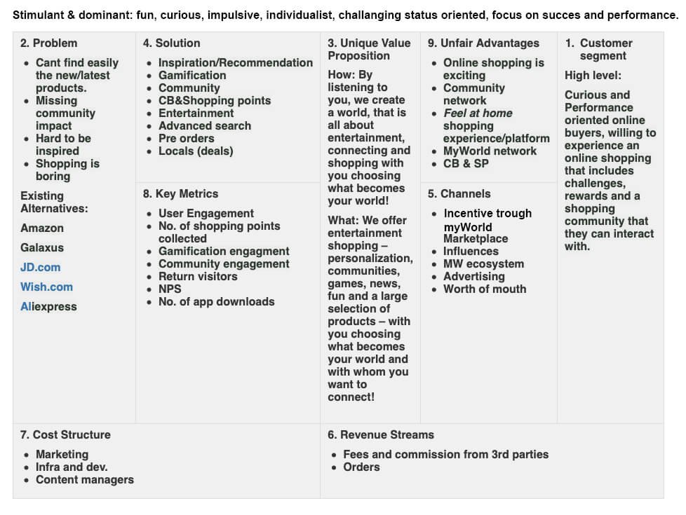
So now that we completed phase one – and we created the basic shopping functionality, it was time to explore further and see what we could bring extra to stand out from the competition. We wanted now to target the following two personas – corresponding to the Limbic® types stimulant and dominant.
Our team got much bigger and more multidisciplinary. We met as a team for a one-week workshop in Switzerland where we explored ideas on how to differentiate our product from the competition and make it stand out.
Innovation
We did not want to offer just a mobile app but an environment where our customers feel at home, they are in the center, and they can have a personalized experience. They can connect with others, can share information and interact, help others. Also, we intended our users to have fun while shopping, create and personalize avatars, collect rewards, increase in level. We wanted to do all this by connecting the entire power of the group, not just the shopping section.
Also, as part of this Innovation process, we set up themes and had workshops around the company to gather ideas from our colleagues working on all aspects of the company. I led my self one of these workshops – with the thematic of personalization.
Learning from mistakes and adjusting
I continued with prototyping and added the new features and functionalities in the flow. When we reached a more concrete point, we tested this with the clickable prototype and an online survey. However, results told that we need to step back on some of the features, especially the gamification, and find a way to offer them for the users who are interested but without getting in the course of the other users.